Type Design:
Praeterita Halbfett!


Inspired by German Expressionist woodblock typography, early handwritten Bauhaus manuscripts, and of course the timeless Futura.
Praeterita means “The Past” in Latin, i.e. the opposite of Futura. Futura looked forward to the future of typography. Praeterita looks back at the type that prefigured the Bauhaus.
At a certain point I decided that I wanted Praeterita to look like a pre-Bauhaus German version of Futura. Like Futura, but the opposite. It’s almost like if you sat down with a German Calligrapher in 1920 and described Futura to him and had him try to draw it with a broad-nibbed pen based just on your descriptions.
Futura is beautiful. I don’t care what anyone says. I think it has earned its popularity. In making my final type specimen, I looked at many of the original 1927-1928 Futura specimens from Paul Renner. I wanted to reproduce that look and even borrowed some of the spreads precisely.
I decided to Riso print the red to get it nice and vibrant. I felt that the specimen should be sewn with red thread to further enhance the vintage quality of it. Unfortunately, I was a little over-confident in my sewing ability and quickly realized it was not going to work out if I was doing it. Dwhani (a first year MFA candidate) very kindly offered to help me and sewed one copy together in no time. Thanks, Dwhani.
Graeme Swank and Mary Catherine Pflug of Monotype attended our final critique and seemed to like my design, which was great to see. Mary particularly liked my unconventional umlauts which she said would be perfectly acceptable in the tradition of setting diacritics no higher than the ascender.
I spent much less time on Praeterita than I did on Graham Grotesk, not because of any lack of effort but just because I learned so much from making my first typeface. Now the process can be really quick. I’d imagine I’ll get quicker and quicker still. Despite how many fewer hours Praeterita took, people seem to like it more because it’s admittedly more interesting looking.
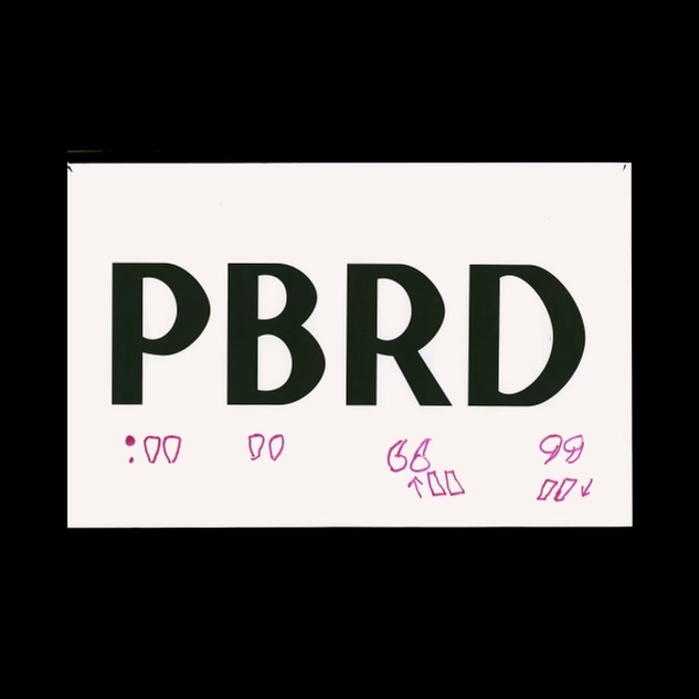
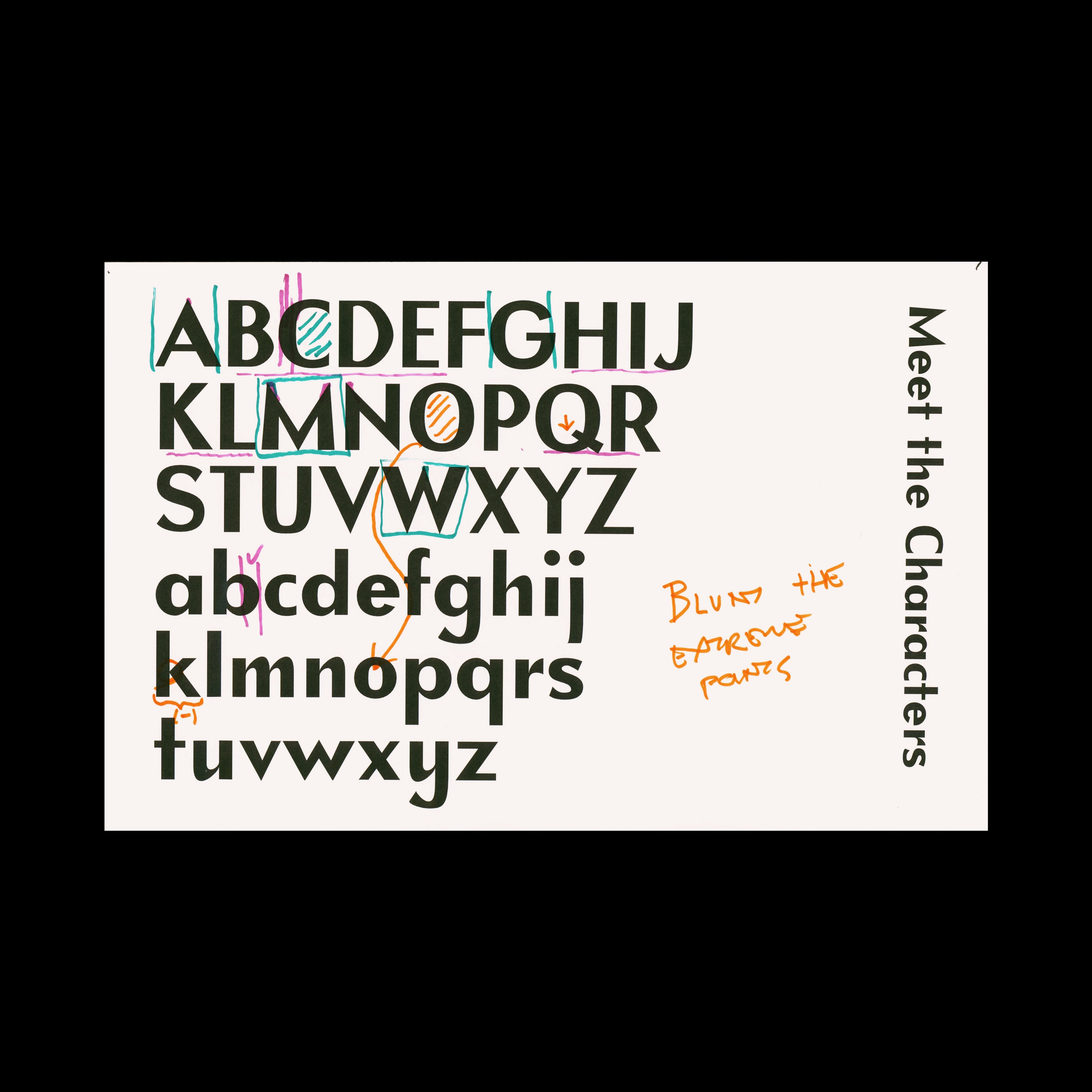
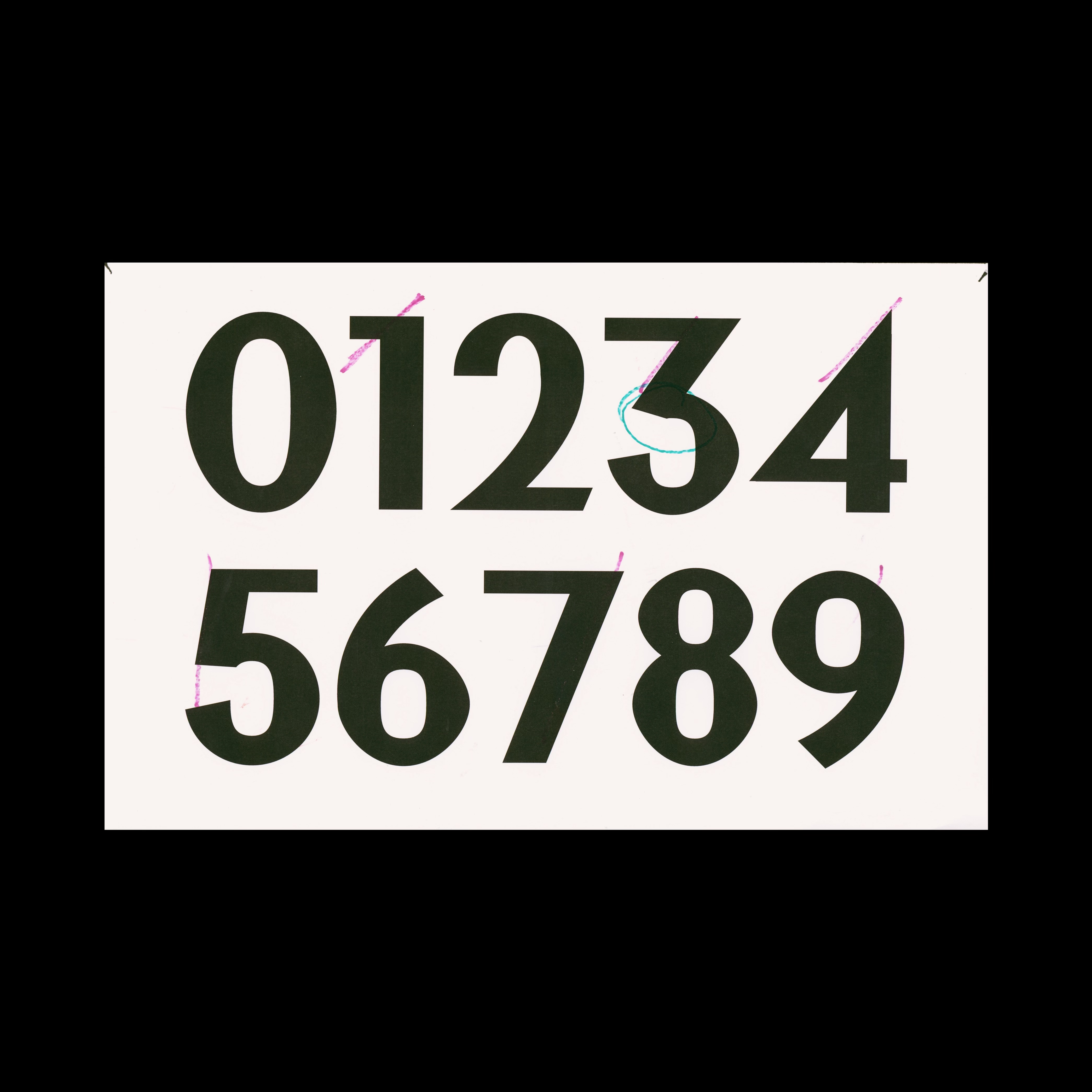
 Can’t say that I blame them for liking it more.
Graham Grotesk
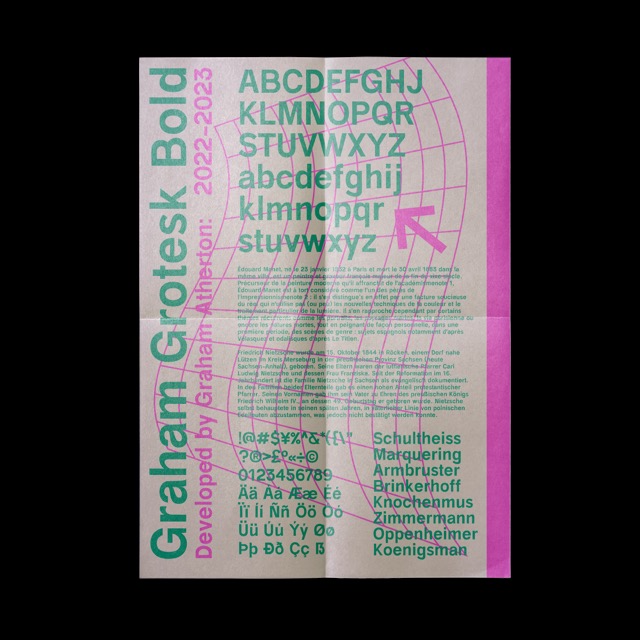
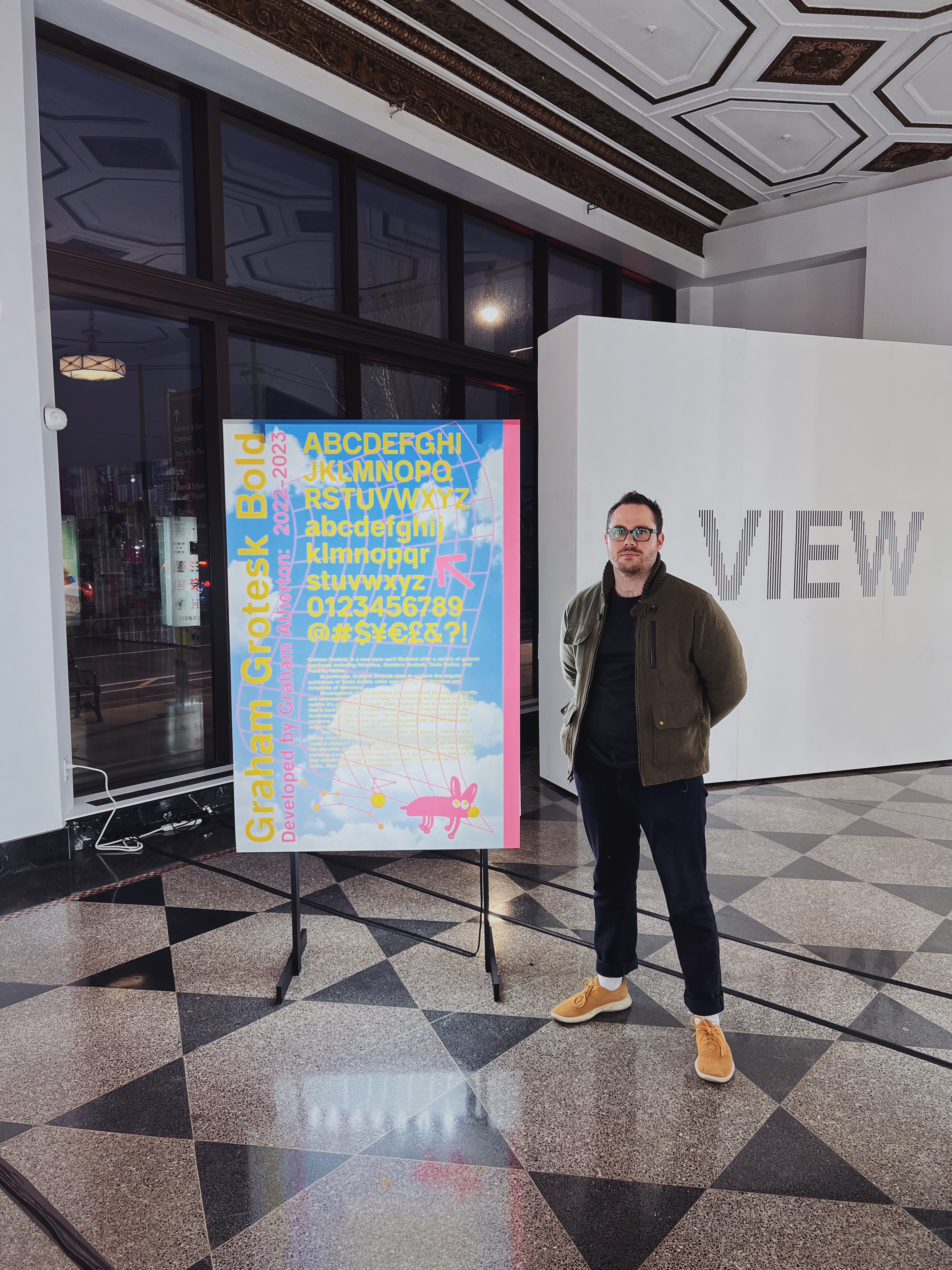
Graham Grotesk is a new sans-serif Modeled after a variety of grotesk typefaces including Helvetica, Akzidenz Grotesk, Trade Gothic, and Franklin Gothic.
In particular, Graham Grotesk aims to capture the angular quirkiness of Trade Gothic while maintaining the elegance and simplicity of Helvetica.
Development of this typeface has vascillated between originality and convention. I will try to make it interesting and unique and then realize it’s gotten out of hand. Then I make it look more standard and find it boring. This cycle goes on and on ad infinitum, much to my frustration. At the very least, I’ve learned a good amount from the progress and have come to both understand and appreciate type in ways I wouldn’t have thought possible before.
The most important questions when designing a typeface are these: what defines the character of my type? What characteristics make it distinct? For Graham Grotesk, that character all stems from the shoulder of the n. the shoulder meets the stem at a sharp angle, creating a unique counter-space.The u is just an upside-down n. Is that cheating? I think it should be allowed. I don’t play by the rules...because I don’t know them.