Recent Highlights:
The Graham Grotesk Letterpress
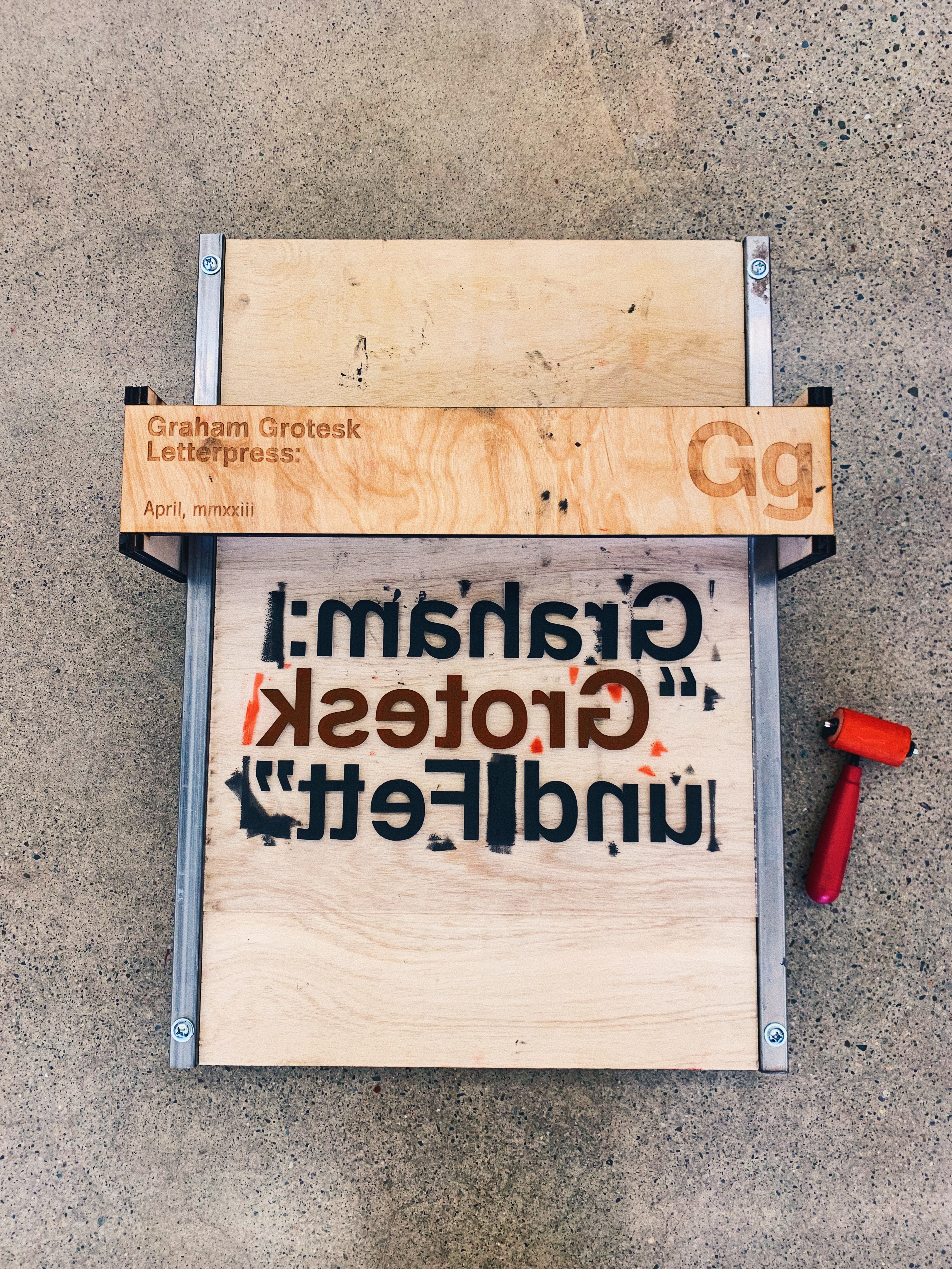
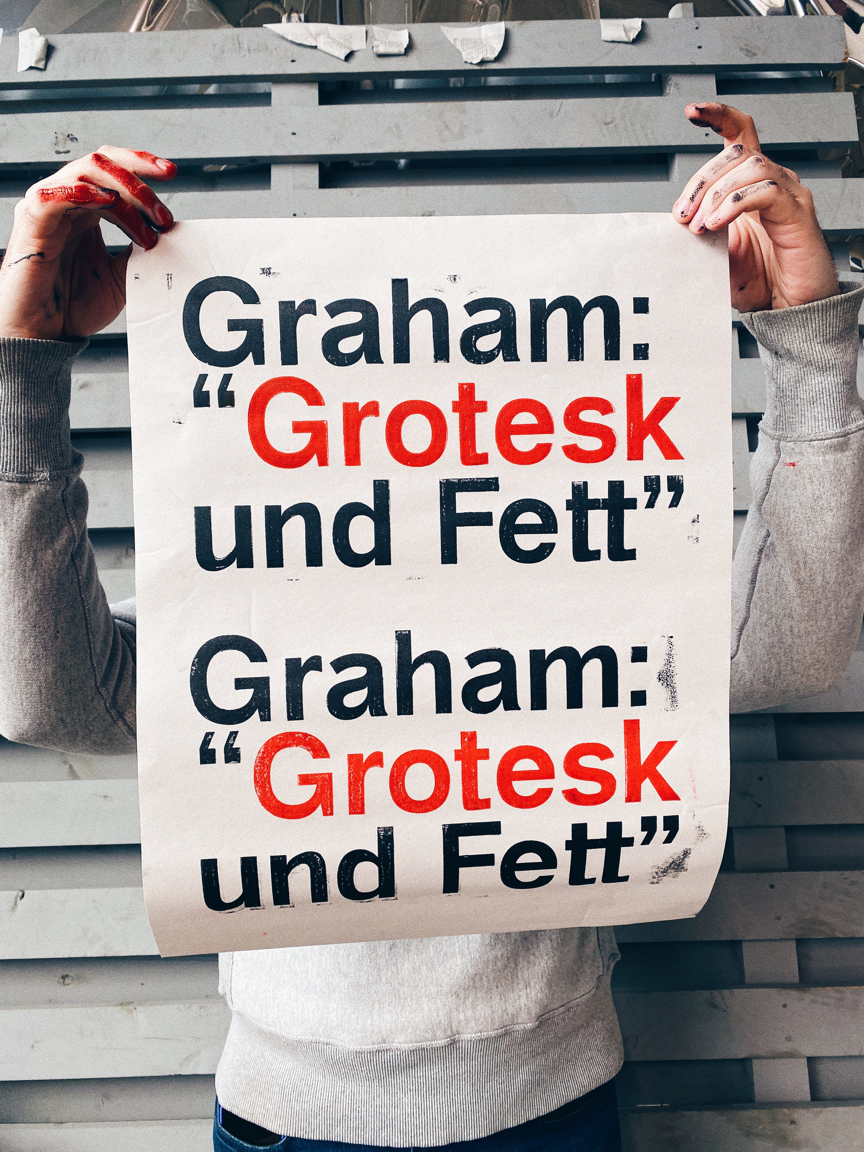

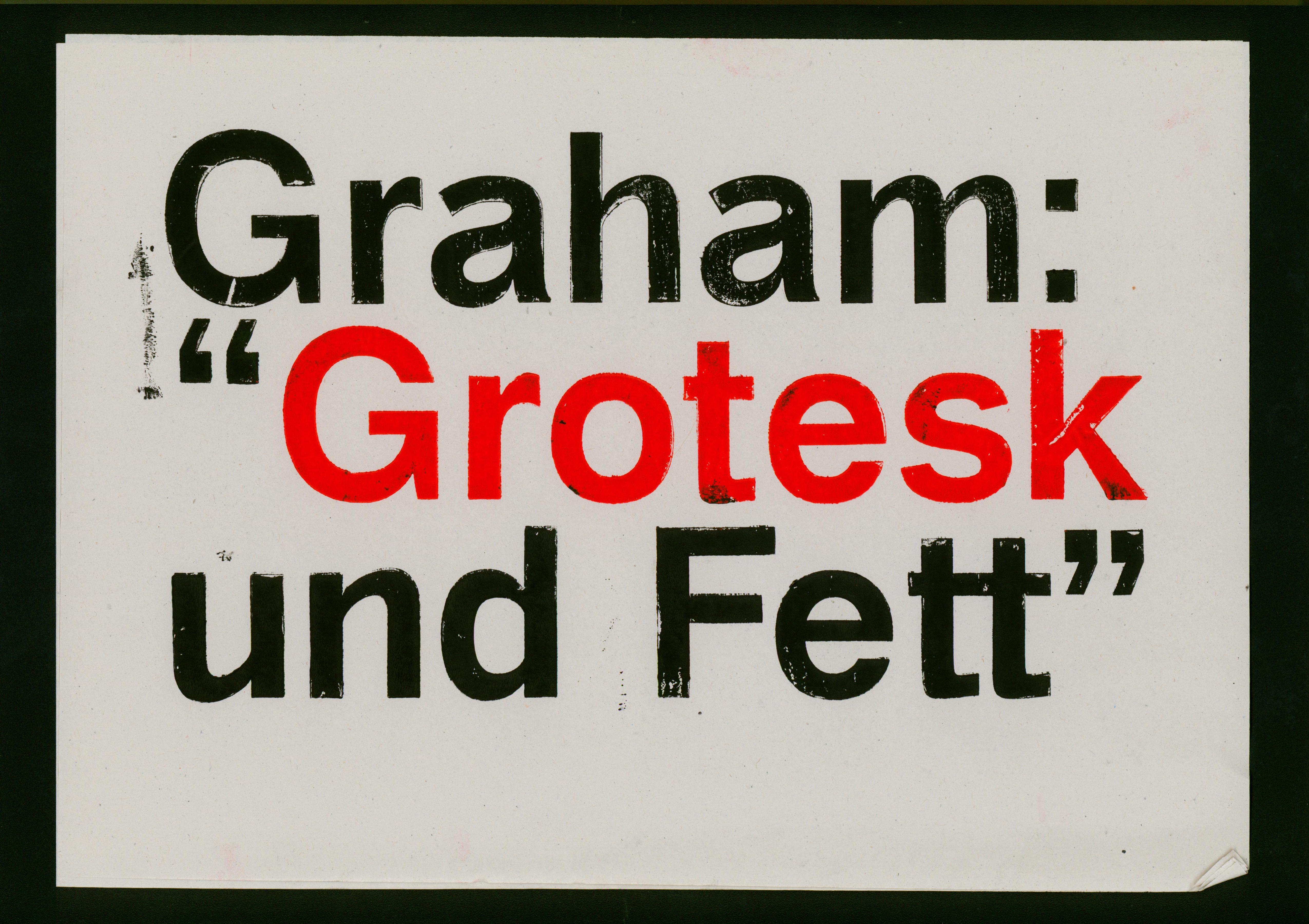

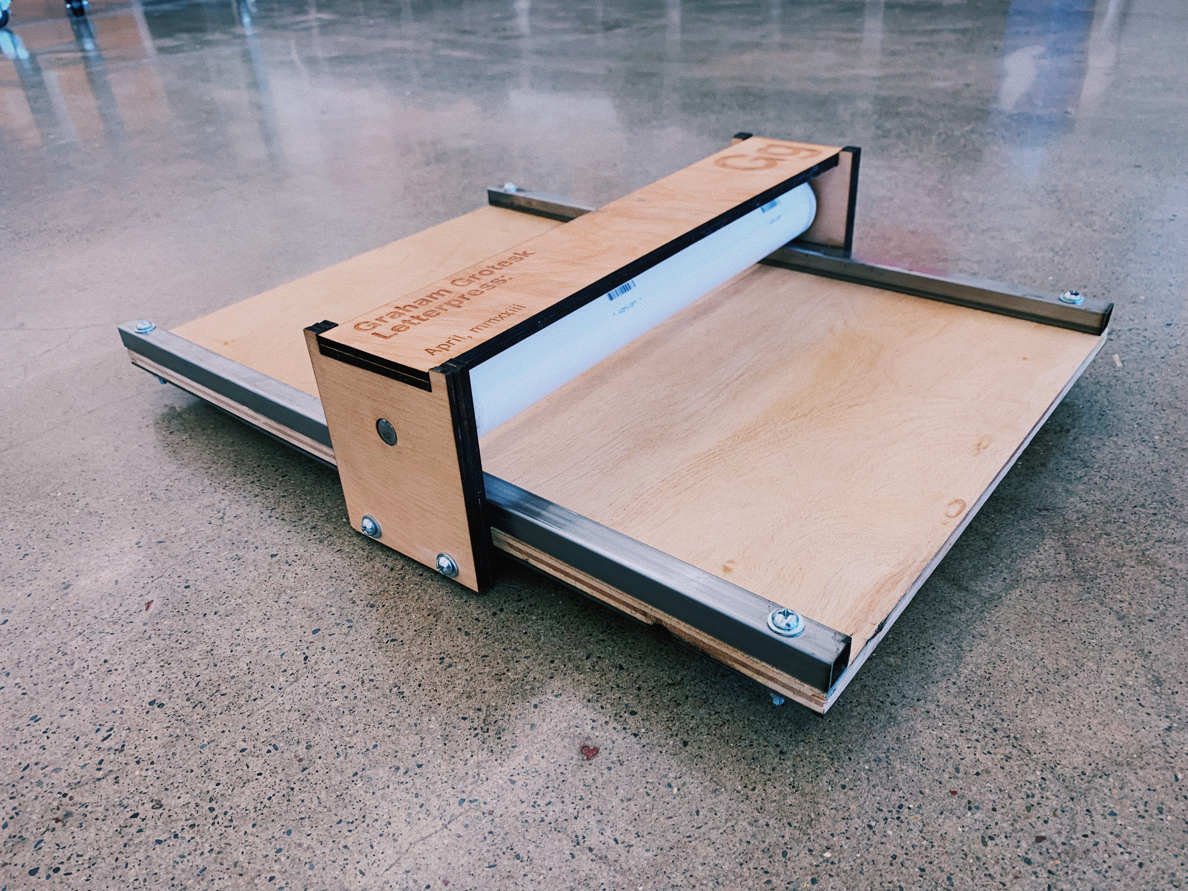
I built this letterpress based on plans by Javier Viramontes. I used this press to print exactly one poster in my own typeface that I designed. Was it worth it?
The Ramp Altarpiece


Elective Flyers for BU’s SVA


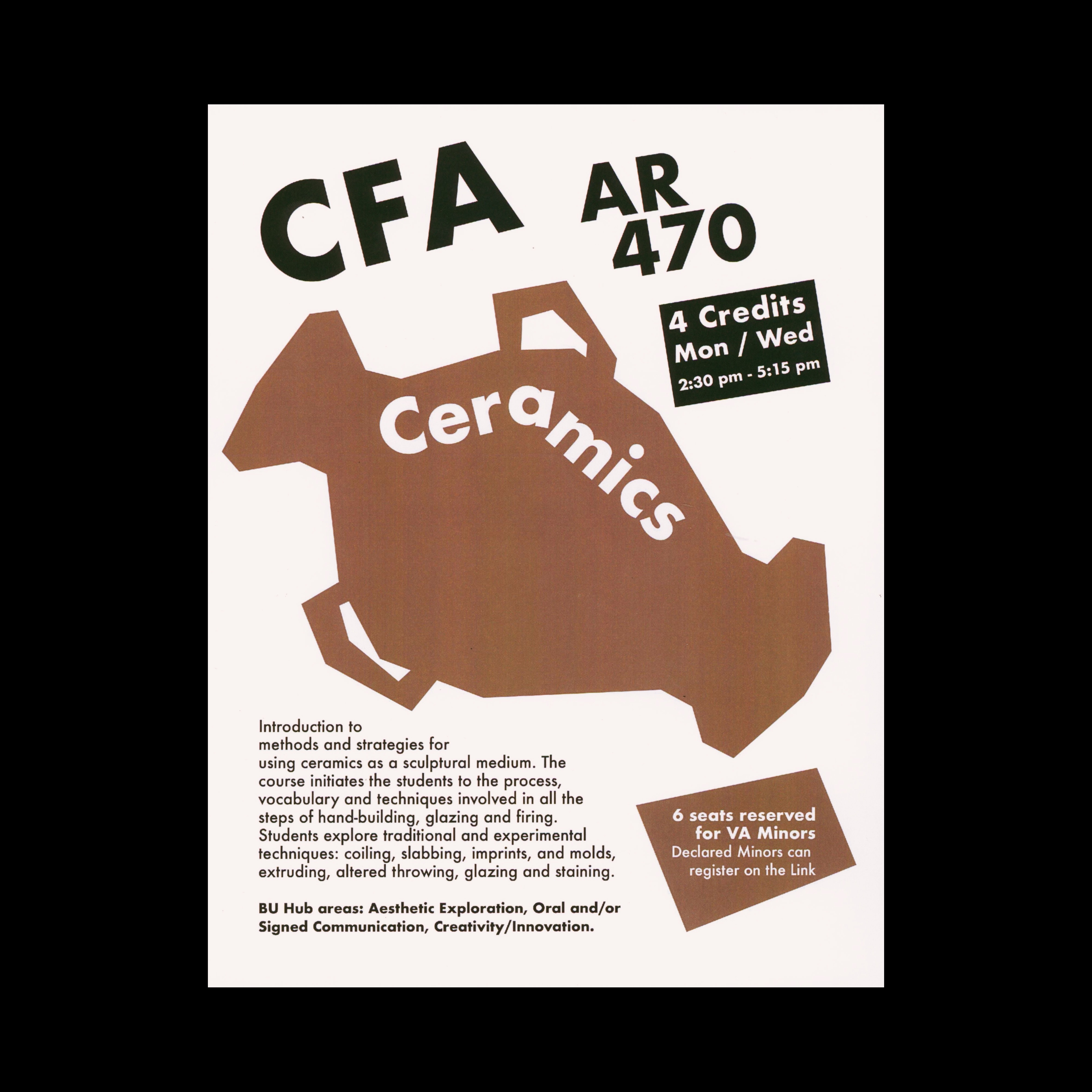


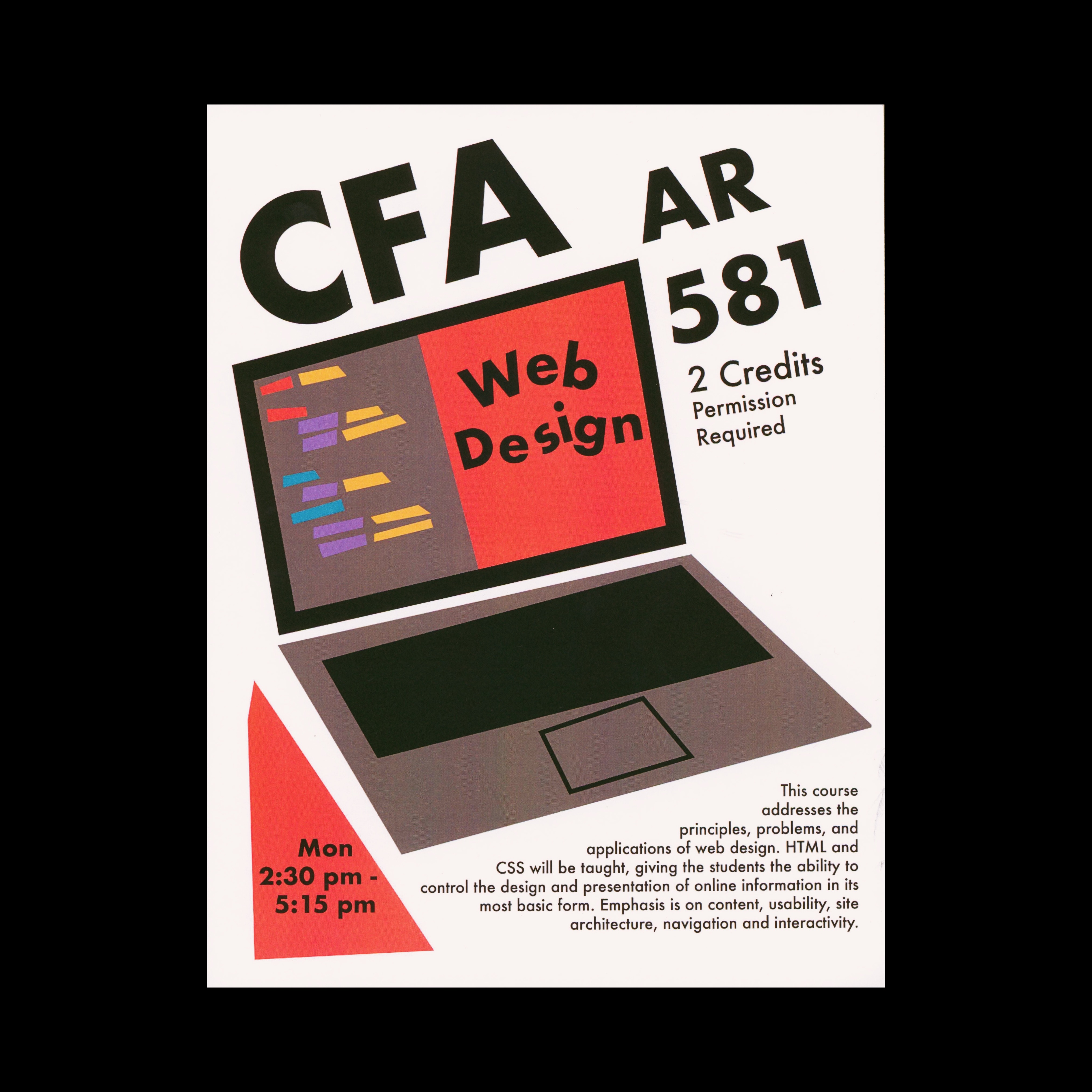

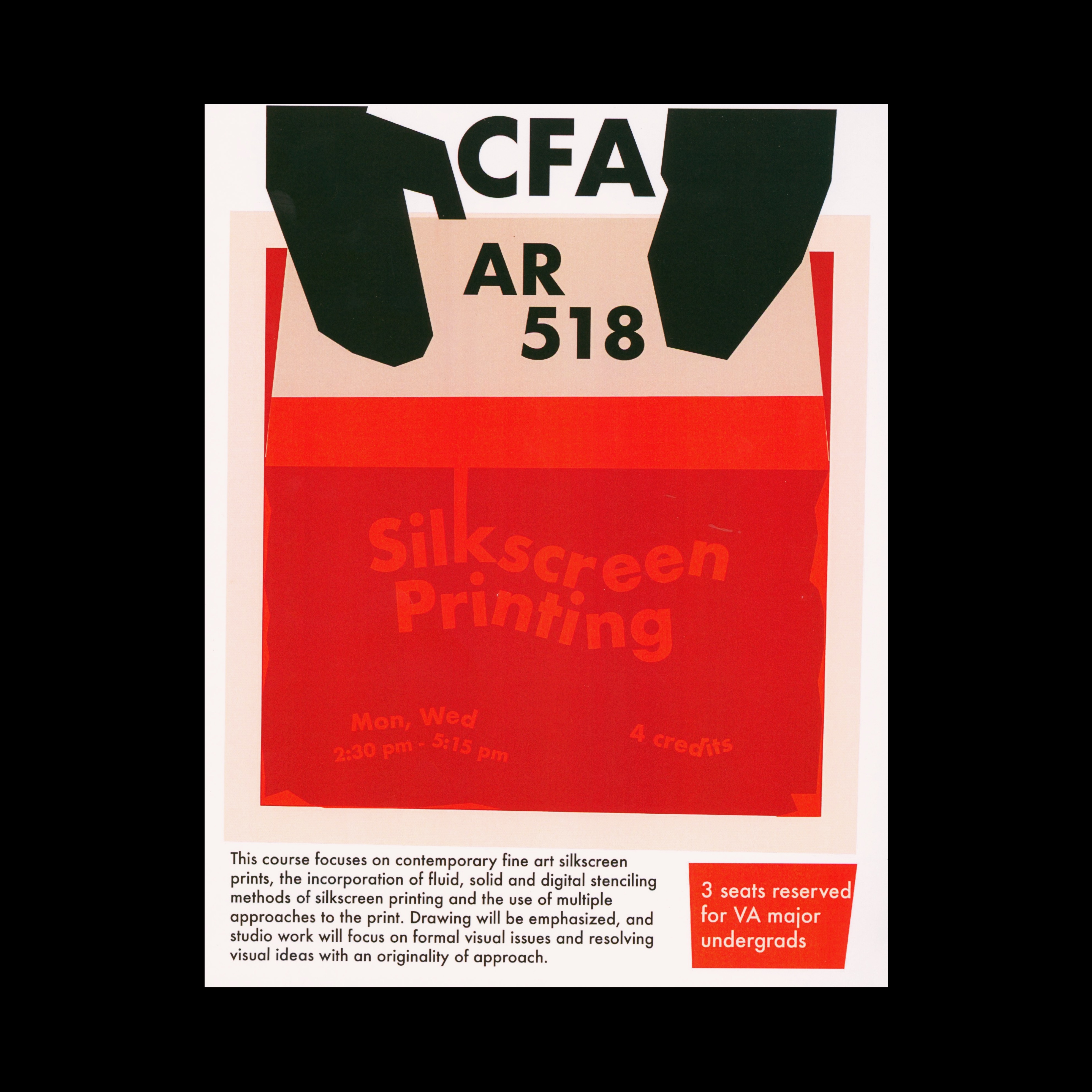
This series of flyers were a work project for BU’s School of Visual Arts. I designed a total of 20 flyers advertising elective courses and these are my 10 favorites. I wanted these to feel playful, angular, and colorful. Despite designing them in illustrator, I really hoped for the to look more like mid-century analog compositions that were laid out by hand. This was a great exercise in developing a distinct, memorable aesthetic across a series of similar supplies.
Praeterita Halbfett!


Inspired by German Expressionist woodblock typography, early handwritten Bauhaus manuscripts, and of course the timeless Futura.
Praeterita means “The Past” in Latin, i.e. the opposite of Futura. Futura looked forward to the future of typography. Praeterita looks back at the type that prefigured the Bauhaus.