Editorial:
Graham: “Grotesk und Fett”
Graham: “Grotesk und Fett”

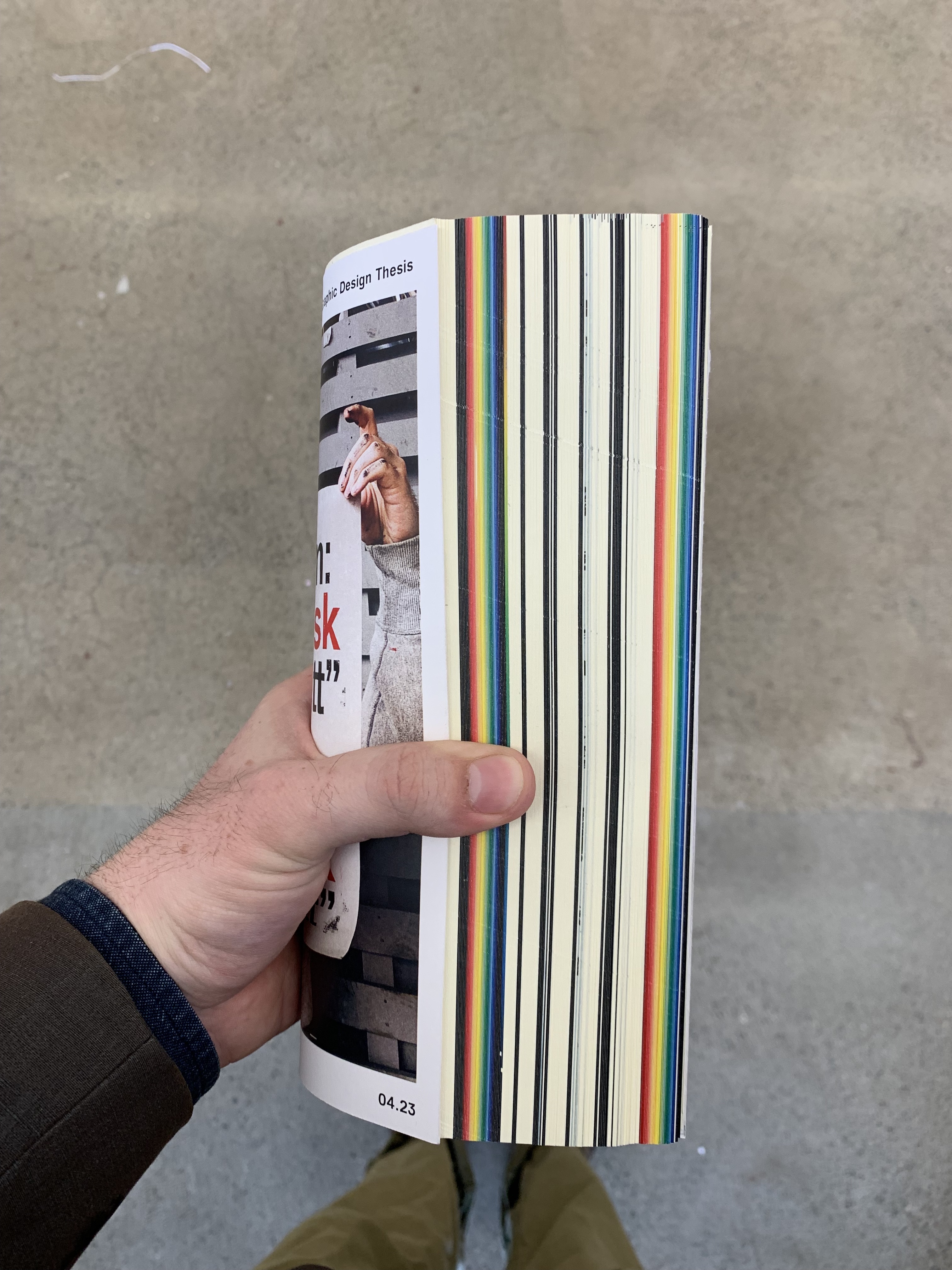

My thesis book, Graham: “Grotesk und Fett”, was an exercise in the concept of Gesamtkunstwerk. I wanted to design every component of it, including the letters. The whole book is typeset in my original typefaces Graham Grotesk and Praeterita.
o sweet spontaneous earth
o sweet spontaneous earth
One thing I aimed to do with my design was to incorporate the artist into her own art. Wise paints lots of portraits of her friends, and those depictions often place them in a boundless, surreal space with a vibrant, cloud-spotted sky as a backdrop. I attempted to apply this sense of boundless airiness throughout the entire book.
This book features a collection of ten essays. Every essay begins with either a full-bleed portrait in the style I described, or a photograph of Wise herself given the same treatment: being made to look as if she is floating among the clouds.
Beyond Surface
Beyond Surface
I think one of the most common misconceptions about typography and possibly design at large is that simplicity is easier to design. In some cases that is true, but simplicity can be a very taxing constraint. It is easier to design a complex, abstract typeface than a simple geometric one because sans serifs demand perfection and exactitude. I’ve come to appreciate just how perfect Helvetica is and I believe its reputation is earned. Using it here felt appropriate since it is so versatile and its neutrality allows it to work well with a wide range of topics.
The real highlight of this project for me was the cover and title pages. I wanted to create an illustration that evokes a feeling of delving beyond the surface of a topic. I had an image of this in my head and needed to draw out some sketches before realizing it in Illustrator. The title pages were a pared down version of the outside cover printed on vellum so that the reader can peel away layers as they move beyond the surface of the book itself and engage with the material.
Inventory Book
Inventory Book
This book was a sort of dry-run for my thesis book. I experimented with some of the things I wanted to try in the final product. Everything after the cover and title pages is set in Graham Grotesk. I experimented with some different image treatments and used a rough, uncoated paper.
This process was very informative as I began my thesis. I found this paper to be too coarse and heavy. The paper I ended up using for my thesis was 70 pound uncoated linen, which was much better.
Blue Notes
Blue Notes
This is my process book from the Spring 2022 semester. In the spring I started studying the design work of Reid Miles who designed for Blue Note Records in the 50s and 60s. This book was a sort of homage to Miles and to Blue Note in general. I set the book in Clarendon and Trade Gothic, two of Miles’ favorite typefaces.
The page size is also 7’x7’, the size of a standard 45 rpm record. I liked the idea of making everything blue to lend a sense of consistency to the whole book. The pages were laser printed, but the cover was printed on Riso with Medium Blue.